Deconstructing Design: 4 Iconic Logo Designs to Look out for
Every brand needs an identity to flourish. A personality that defines what the brand does, who does it cater to, and why anyone should invest in it. And do you know the smallest unit that can pretty much sum up a brand for anyone?
Its logo. The simplest element of its identity.
There’s a lot of efforts and thoughts that go into creating a great and timeless logo. Something that can define a brand for the years to come. The success of these logos and brands are evidence of the importance of a great logo design. And today, we’ll be looking at 4 exceptionally great logos that all of us can learn a thing or two from.
4 Iconic Logos to Look out For
General Electric
General Electric was formed in 1892 as the result of a merger between two prominent companies dedicated to electric innovation. The company started off with a simple logo with a small case g and e. A logo that has survived the test of time, albeit with some minor cosmetic tweaks over the years.
Changes such as the inclusion of a circle around the letters g and e to signify a growing global presence. More so, the circle has swirls to the inside, pointing towards the four directions of the compass. Another subtle hint to GE’s reach and expertise in different directions, not just geographically but in terms of domains.
Amazon
Started in 1994 by Jeff Bezos as an online bookstore, the company went by the name ‘Cadabra’. Within a year, the name was changed to Amazon and the company touted itself as ‘Earth’s biggest bookstore’. The logo then was a modest combination type and plain to a fault. It didn’t really exhibit a personality.

Fast forward to today, Amazon’s logo is one of the most appreciated ones. While the logo in essence still says Amazon, it’s the extra touches that make it wonderful. First, there’s the yellow arrow that goes from A to Z in the name. It signifies how they take care of all customer needs, right from A to Z. And second, the arrow/arch very much resembles a smile, coinciding with Amazon’s tagline of “delivering smiles to customers’ doorsteps”.
Not to forget, the colour yellow (of the arrow) also represents positivity, energy, and happiness. Isn’t this an all-round feel good logo, yeah?
Toyota
From the time Toyota was started, it stood for something simple yet strong: customer’s happiness and superb quality. As time progressed (50 years since its birth, to be precise), Toyota came forth with the current iteration of its Logo Designs. The one we see and know Toyota for today.
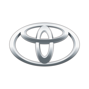
The current logo again follows into the most basic virtue of simplicity yet speaks volumes about the brand. First of all, the white background of the logo, representing Toyota’s ‘infinite value’ system. Added to its core values, innovation, integrity, great value, and the joy of driving define the brand. Add to that the three different oval rings, the two interesting ones inside representing the customer’s and company’s heart. Together, they form a T, representing the brand Toyota. And the outermost ring representing the world in unison with Toyota, and of course, a steering wheel.
Talk about some heavy symbolism.
Lufthansa Airlines
The final subject for today is the iconic German airline, Lufthansa, and its logo, a crane in flight. A symbol that has remained unchanged since it was adopted by the company in 1926. The crane in flight originally represented the coming true of the dream to fly as effectively and efficiently as birds. Birds, that have actually been the inspiration for mankind to invent airplanes. Especially the crane, that represents stability and strength.

The symbols alone do just half the job. The Logo Designs features the colours white and dark blue (and earlier, gold), signifying the premiumness of the brand and its services. This logo makes incredible sense for the premium German airline, whose name also holds immense significance. How, you ask.
Luft = Air, Hansa = Crane, both in German.
What Can We Learn from These Iconic Logo Designs?
Quite a few things, actually. The first one of course is that simplicity triumphs (also, Triumph, the iconic British motorcycle manufacturer, has a great logo desgns !).
Second, the most iconic logos stand the test of time and don’t change, but evolve. They grow with the brand, to accommodate its evolving personality.
And third, that the symbols in the logo desgns alone don’t make it great. The choice of colours play a pivotal role too. Imagine how it would be if Amazon’s smile arch was coloured green instead of yellow. Or if Lufthansa had chosen to go with bright pink instead of dark blue.
Some things are best left unexplored and unthought of.
Did you find this information valuable? Leave a comment and tell us what you think of it. Meanwhile, if you’d like to know more about how to design a great logo, here’s our post on it.
And we shall see you in the next round up of logos.
Saypan is best logo design agency in Pune
Luft = Air, Hansa = Crane, both in German.
Environmental graphic can create an inviting and functional spaces in any setting, be it professional or personal. Its importance in shaping daily life experiences cannot be overstated. Today, many brands are heavily investing in environmental graphic design to enhance the appeal and look of their spaces accessible to their team or the public.