


NIRAMAYA HOSPITAL
Care and trust in perfect harmony.
For Niramaya Hospital, the goal was to create an identity that reflects more than just healthcare it needed to communicate care, warmth, and trust at first glance. As a maternity-focused hospital, the brand had to feel reassuring, human, and deeply connected to families.
We developed a thoughtful and balanced design system that blends medical professionalism with emotional sensitivity. The logo and visual language were crafted to evoke comfort while maintaining clarity and credibility across all touchpoints.

Logo Exploration

The "N" symbolizes the parent-child bond, with soft curves expressing care and trust, while teal and pink tones reflect health, warmth, and compassion.

Previous Logo

Revised Logo


NIRAMAYA GUIDELINES
Building brand guidelines for Niramaya Hospital using the "N" from the logo ensures a consistent, professional, and recognizable identity. It strengthens brand recall, maintains visual consistency across all platforms, and enhances trust and credibility in healthcare. These guidelines help standardize logos, colors, typography, and design elements, making communication seamless and reinforcing Niramaya's distinct and memorable presence.


INDOOR BRANDING


Emphasizing the importance of gender
equality and girl child empowerment, this
standee promotes awareness and social
responsibility, aligning with Niramaya's
values of care and compassion.


SIGNAGES
SUSPENDEDSIGNAGES
The Suspended signages serve as directional guides within the hospital, ensuring clear navigation for patients and visitors. Designed for easy readability and consistency, these signages align with Niramaya’s branding, enhancing the overall wayfinding experience while maintaining a professional and organized hospital environment.


ILLUMINATED SIGNAGES
ILLUMINATEDSIGNAGES
The illuminated signages include fire exits, floor maps, and fire alarm indicators, etc. designed to glow at night or during a power outage. These ensure clear visibility in emergencies, guiding patients and staff safely out of the hospital, reinforcing safety, preparedness, and compliance with emergency protocols.

OUTDOOR BRANDING

ACTUAL SITE IMAGES
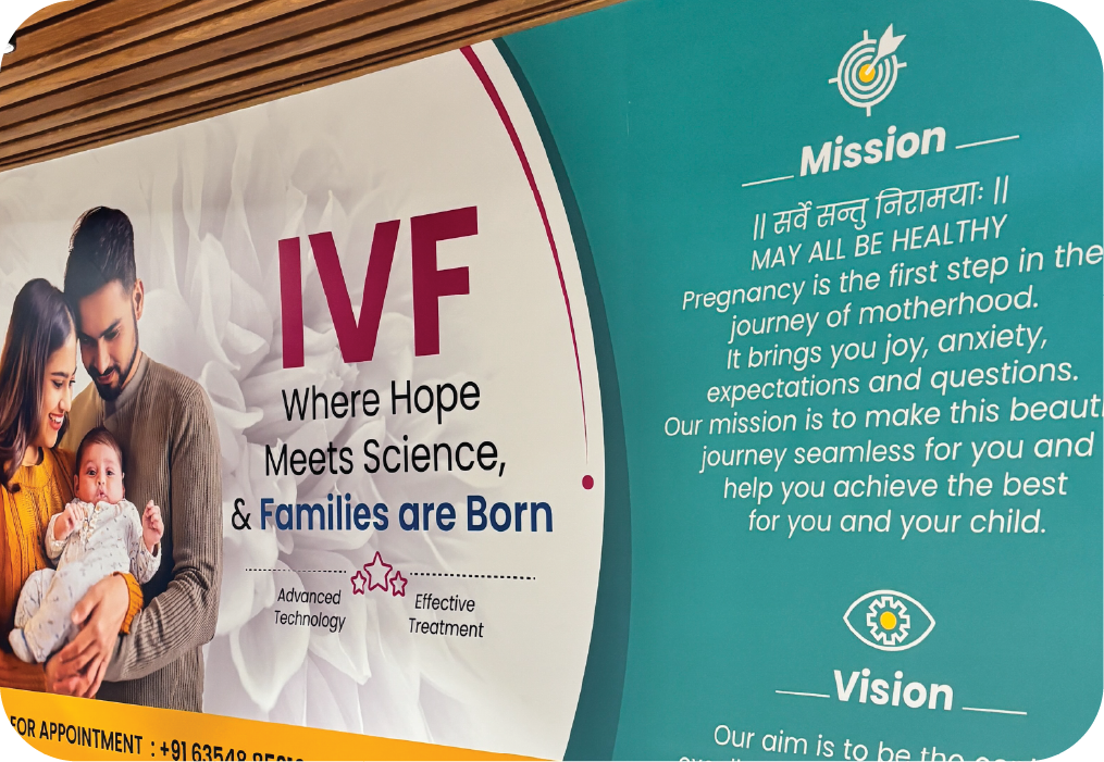
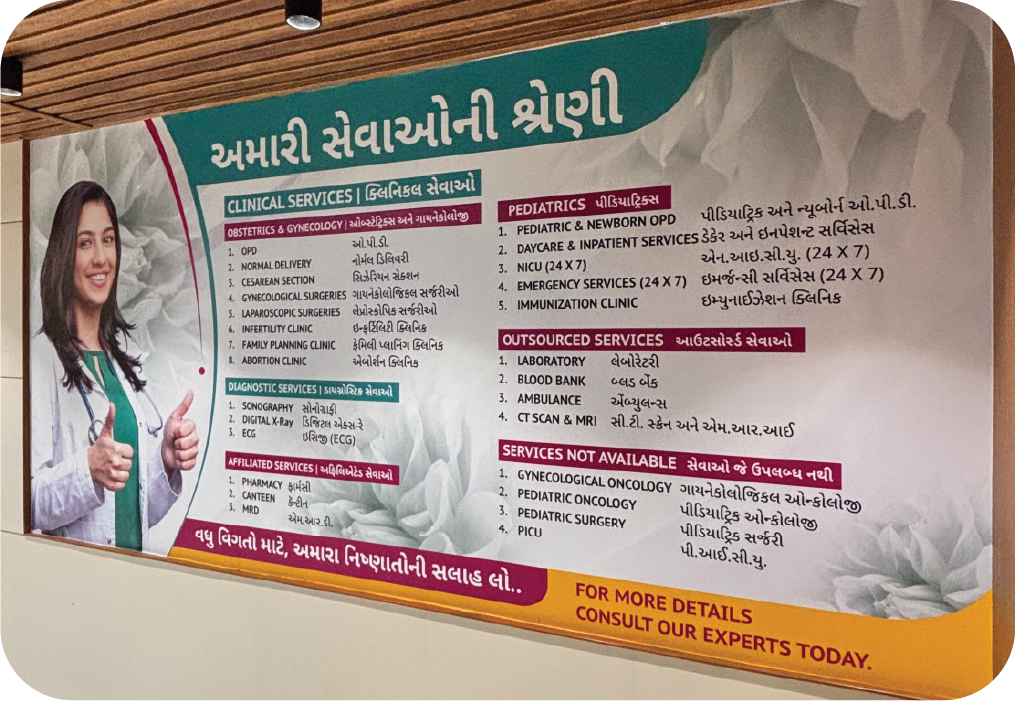
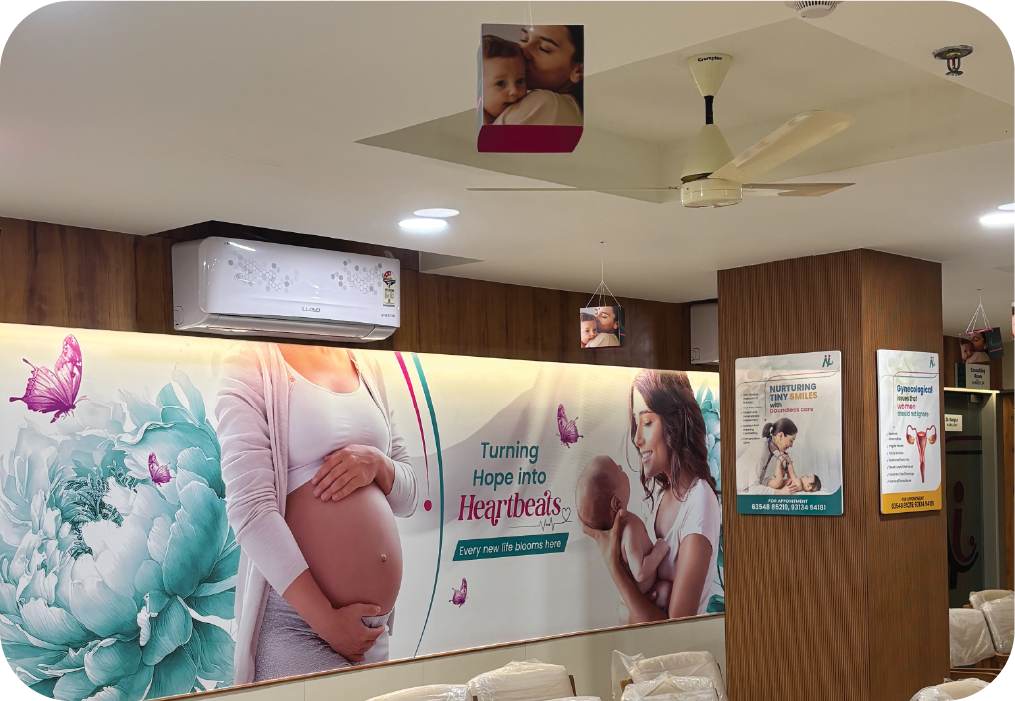
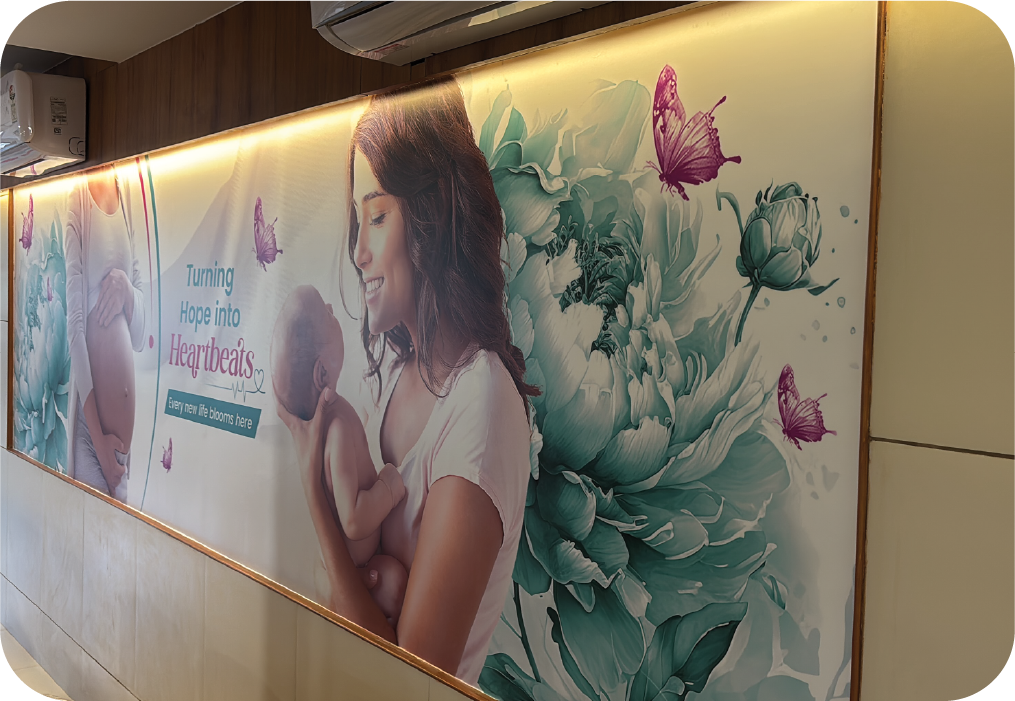


Every design element from color palette to typography was carefully chosen to represent compassion, reliability, and modern healthcare excellence. The result is a cohesive identity that feels approachable yet authoritative, ensuring strong recall and emotional connection.
With scalability at its core, the system adapts seamlessly across digital platforms, print materials, and on-ground branding creating a consistent and meaningful brand experience.
Related Projects


